Developing white-label illustration style
About the project:
As the designated product designer, though not a professional illustrator, I led this project, which was time-intensive due to extensive redrawing, feedback incorporation, numerous variations, and color adaptability testing. The process was intriguing but demanded patience and persistence.
Product description:
Ondato provides solutions in the field of identity verification, Know Your Customer (KYC), Anti Money Laundering (AML) and such other services. They offer digital identity verification tools and compliance solutions to help businesses authenticate the identities of their users and comply with regulatory requirements.
Goal:
Create a versatile and easily adaptable illustration style for any colour choice.
Role:
Responsible for the implementation of the project with the involvement of 2 other designers at different stages of creation.
Project overview
Defining the problem and the new style
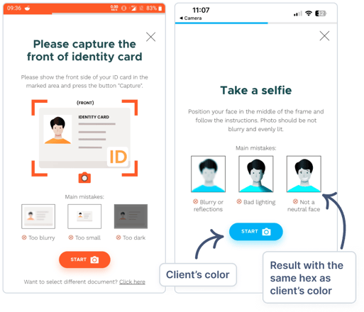
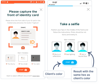
The previous illustration style lacked easy customization. It was created using many layers with settings that often resulted in overly saturated colors or unsuitable shades. Clients frequently complained that 'the colours look different from our branding.' Therefore, as a white-label illustration style, it should prioritise adaptability to accommodate any colour choice.
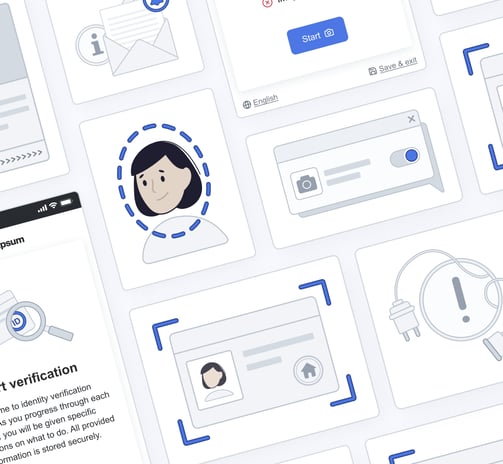
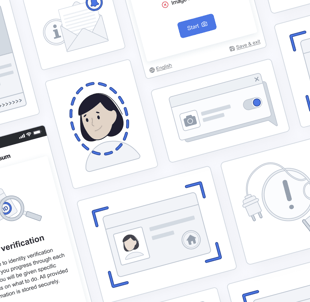
Examples of clients' colour usage
To align with stakeholders' wishes for a new illustration style in our product redesign, together I held a workshop together with 2 other designers. We brainstormed and identified four key style attributes: simplicity/minimalism, friendliness, trustworthiness, and gender/race neutrality. Through diagrams and examples, we explored these themes, annotating why each fit, which helped us define essential graphic elements. Our preferred style emerged as a blend of primary and black colors, line drawings, geometric shapes, and a friendly demeanour.
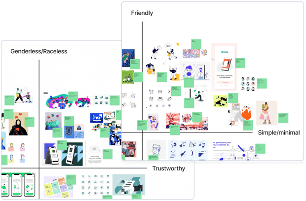

Screenshots of illustrations' workshop
Developing the illustration style
Starting with sketching
I began sketching while keeping in mind the elements we had previously identified as the components of the illustration style such as the combination of black and primary colour, geometric shapes, incorporating line and friendly appearance.
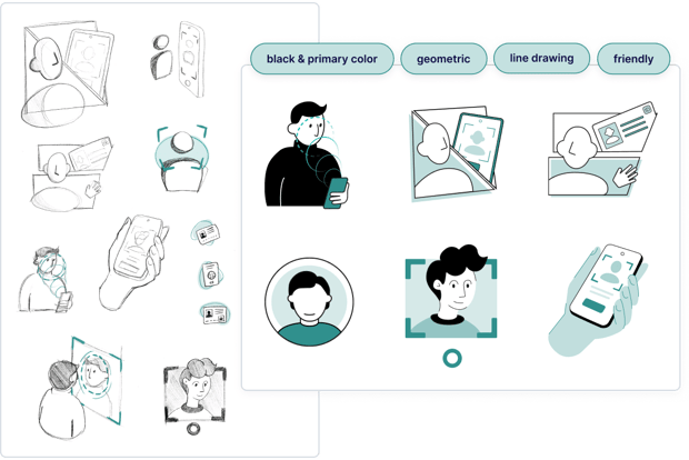
Initial sketches
Deciding on the style
One team member proposed showcasing styles in the office and letting colleagues vote. Although I initially hesitated due to the subjectivity involved, it sparked interest within the team. In result, this approach led to more questions than actionable data. For instance, the marketing team questioned whether the product illustration style should align with Ondato's branding.
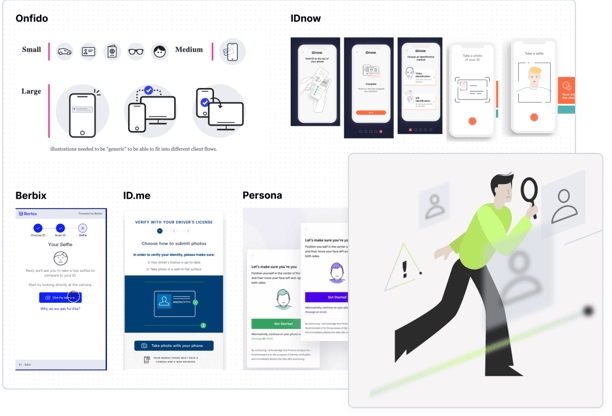
As none of the styles felt right, our graphic designer used the Ondato branding illustration style to create a proposition from the marketing team, while I examined our competitors and brainstormed ideas that could align with them.
Voting board at the office
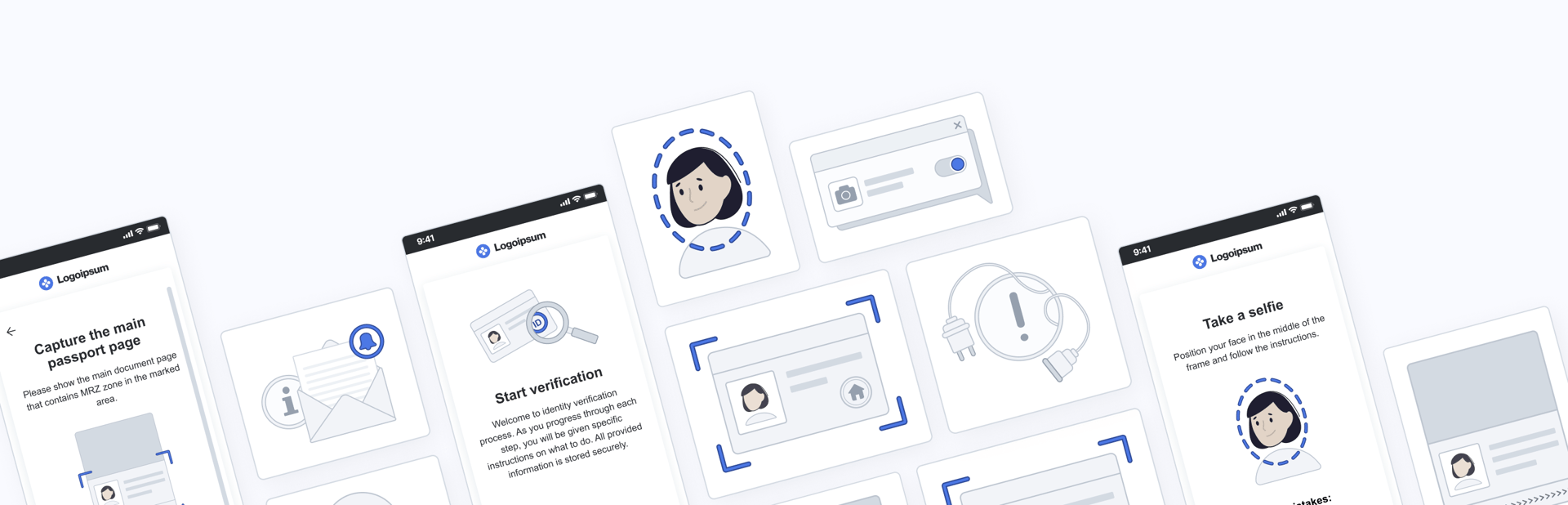
Presented styles with colours from clients list
At the end, we presented three styles to the stakeholders:
1. The one that received the most votes;
2. A style that resembled those of our competitors;
3. An option inspired by the Ondato branding illustration style.
Concurrently, I conducted color testing on the illustrations using colors from our client list.
Competitors examples and Ondato branding illustration style
Stakeholders selected the friendliest style for its appeal, vital for users with trust concerns in identity verification. I developed two versions of this style for evaluation, conducting a Google Survey-based style preference study. Participants chose their preferred style and answered questions, with the results organized into an affinity diagram.

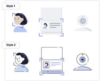
Prepared styles for evaluation
Style evaluation
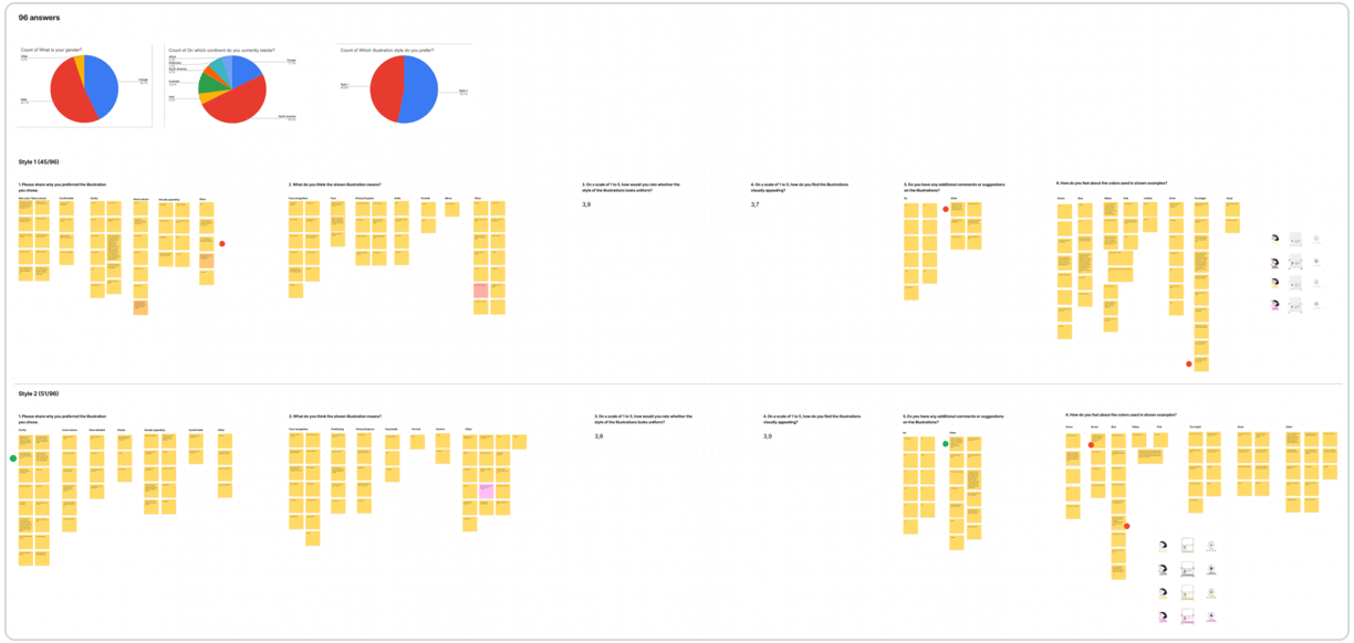
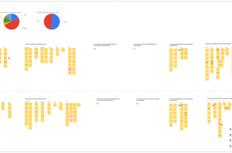
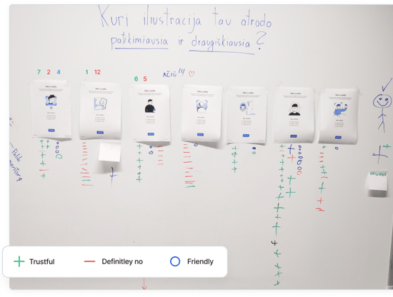
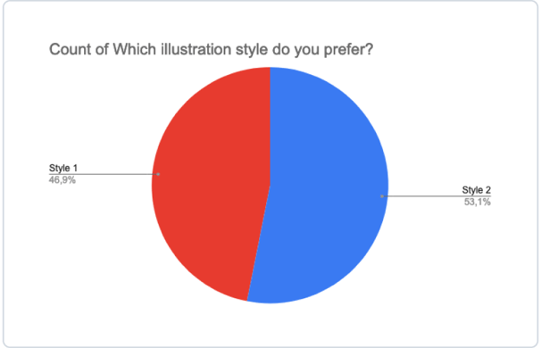
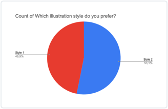
Results on style preference
The answers are based on 96 participants. To my surprise, the results for the first question, regarding which illustration style is preferred, were nearly equal.
Survey answers and feedback divided into groups
User feedback indicated that the first style was more human and comforting, potentially boosting trust in verification, while the second was praised for its high contrast and mobile screen suitability. Further feedback on uniformity and visual appeal showed both styles rated above average.
Summary of feedback
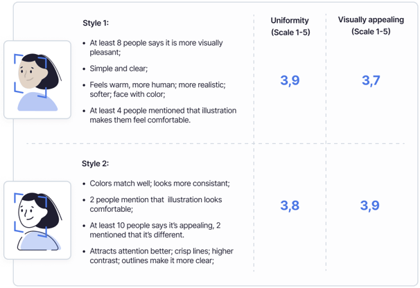
User feedback insights
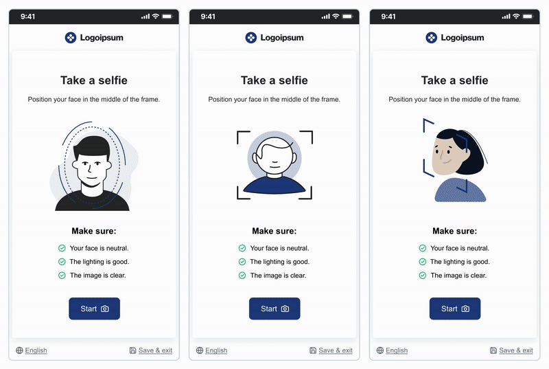
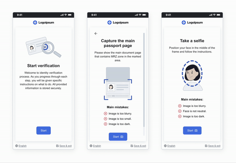
Final result
In partnership with stakeholders, we opted for the first style, despite fewer survey votes, and refined it by integrating outlines from the second style for clarity and crispness. I also employed the design system's grayscale scheme for product consistency. Outlines enhanced primary color utilization, with elements featuring a stroke in a darker shade for improved clarity and visibility.


Conclusions & lessons learned
Although developing an illustration style doesn't always necessitate research or surveys, in this case, they provided crucial insights for style enhancement, leading to discussions that transcended personal preferences. The resulting style effectively meets our goals of friendliness, simplicity, and adaptability to any color. Key takeaways include:
We prioritized friendliness over race or gender neutrality in the illustrations, as agreed with stakeholders.
Office voting for designs, while not yielding valid data, provided team engagement and fun.
Testings or surveys can bring equal results, so at the end of the day the decision is still on you.