
Creating white-label design system
About the project:
Creating an initial white-label design system was an enlightening process, involving the development of foundational elements and main components tailored to our identity verification product's needs. This journey brought team compromises and lessons, culminating in a fully accessible and usable Figma library.
Product description:
Ondato provides solutions in the field of identity verification, Know Your Customer (KYC), Anti Money Laundering (AML) and such other services. They offer digital identity verification tools and compliance solutions to help businesses authenticate the identities of their users and comply with regulatory requirements.
Goal:
Create an initial design system for re-designing and improving a white-label identity verification product on both web and mobile platforms.
Role:
Design system creation from start to finish with the help and collaboration of my team's developers.
Project overview
Design research and exploration
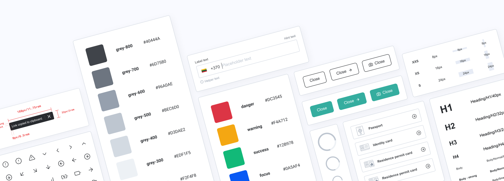
In redesigning an existing identity verification product, I simultaneously developed the initial design system. I began with conducting a UI audit of its functional main flows, cataloged components, documented text usage, and assessed component appearance with white-label colours.
An existing responsive container for information display, enabled me to concentrate on optimising its usability and addressing the primary challenge of adapting branding colors to client needs.
Later, I explored various design systems, collecting ideas and inspirations, and occasionally borrowing a few elements.

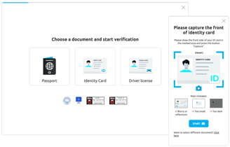
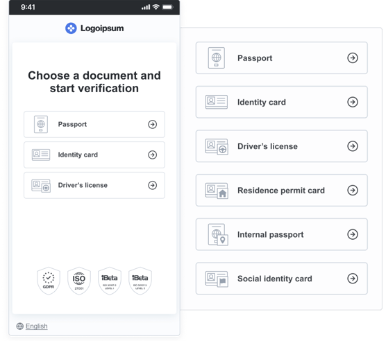
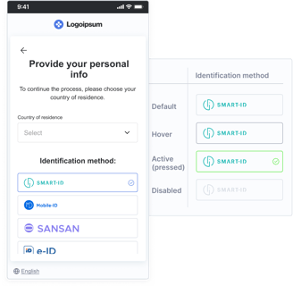
Example of client using KYC flow
Design system development
Deciding on typography
After reviewing past text components, I streamlined typography by using four headings for all content, including modals and error pages, and implemented an 8px rule for hierarchy, with adjustments for usability. Main body text is standardized at 16px for readability across devices, while 14px and 12px are reserved for specific elements like input fields.
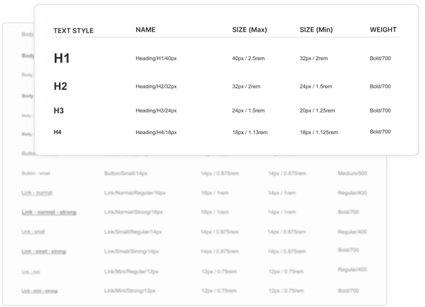
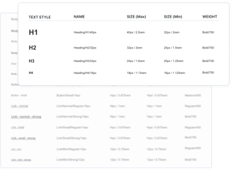
Typograhy table
FOUNDATIONS
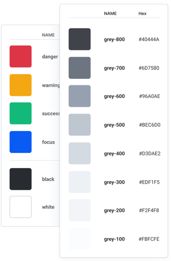
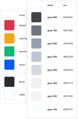
The range of fixed colours
I developed a greyscale palette with a hint of blue for a cool tone, based on 'Refactoring UI' by Schoger and Wathan, to complement any brand color and extending its use to white label illustrations.
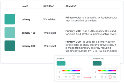
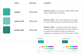
As mentioned, the primary color varies by client and is applied to buttons and illustrations. To extend branding across the product, I also integrated it into input fields, requiring the creation of color variations for input field and button states. I adjusted opacity for input active state and modified the 'Lightness' in the HSL color model for the button's stroke, indicating its active state.
FOUNDATIONS
Settings of the primary colour
FOUNDATIONS
Design system colours and dynamic primary colour application
Primary colour documentation
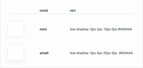
Simple shadows
The matter of spacings
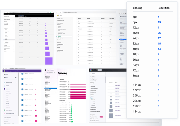
I initially followed the 8px spacing rule without defining a specific number. When developers saw it as a problem, we compromised and settled on having 9 spacing options. Read more about it here.
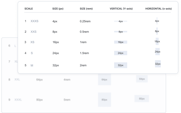
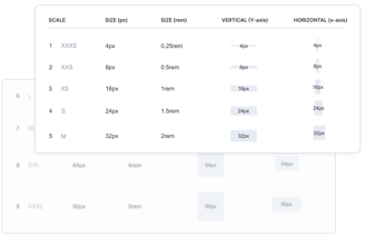
Table of spacings' sizes
I didn't prioritise shadows since there was no immediate need for them at this stage. Therefore, I created only two types: one for the content container and the other for modals.
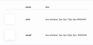
Shadows example
FOUNDATIONS
FOUNDATIONS
Content container (Layout & braking point)
As mentioned earlier, the product employs a content container, which utilizes MIN and MAX paddings inside the container and MIN and MAX margins outside the container. These values dynamically adjust based on the screen width. When the screen width reaches 500px, the design switches to a mobile mode. The specified spacing values control how components are arranged vertically
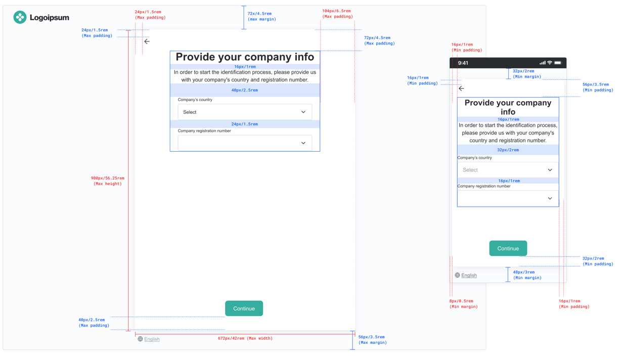
Content frame with layout instructions and specifications
FOUNDATIONS
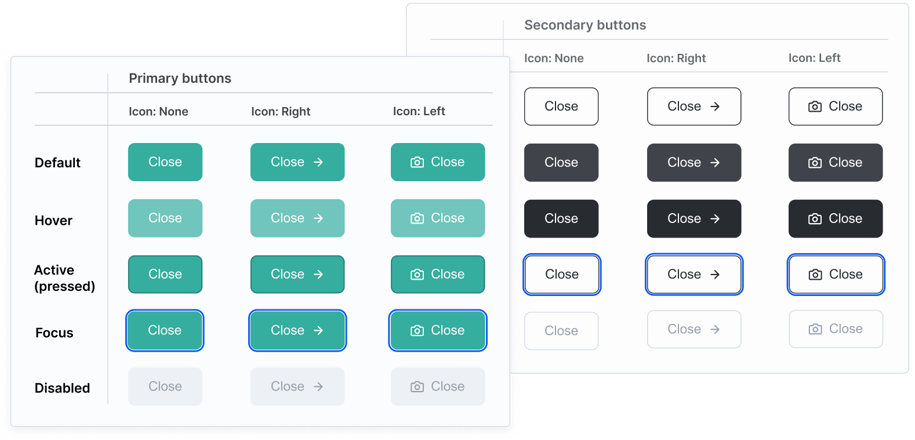
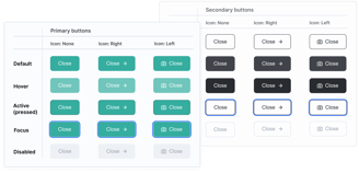
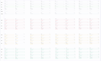
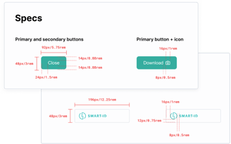
Set of buttons
CORE COMPONENTS

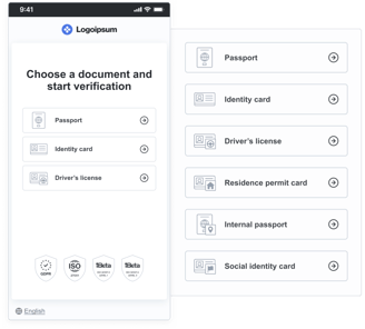
Document selection
CORE COMPONENTS
CORE COMPONENTS
Identification methods

CORE COMPONENTS
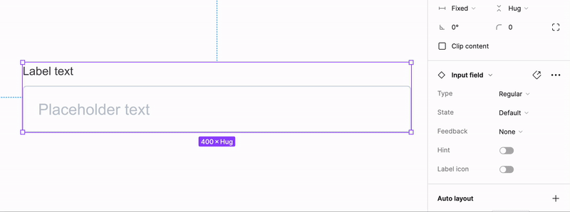
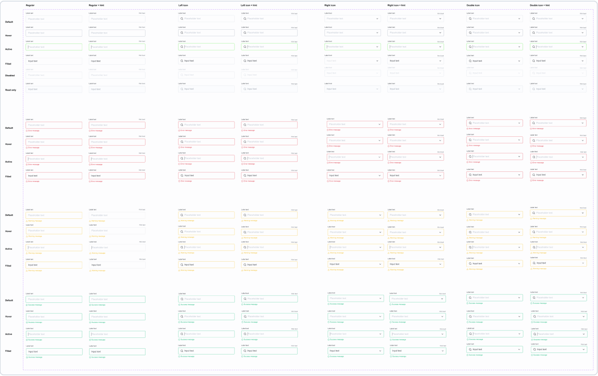
Input field variations
CORE COMPONENTS
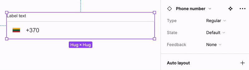
Phone number input variations
Conclusions & lessons learned
The process wasn't straightforward; it involved iterative discussions and compromises with the development team. I'm grateful for their input and the learning opportunity it provided. Here are some key reflections:
2. Reevaluating input field component
I initially applied the 8px spacing rule but adjusted it after developers expressed concerns about code complexity. Following a review of our designs and other design systems, we settled on 9 versatile spacing options, allowing combinations for larger spacings as needed.
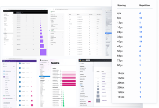
1. Spacing strategy
I designed the input field component with multiple variants for versatility, but in retrospect, its complexity exceeded the current product stage's needs, indicating a more use-case-focused approach would have been time-efficient.
3. Reflecting on documentation
In creating the initial design system, I specified main components and developers used Storybook, but as the sole designer, I now see the value in having documented the rationale behind decisions and provided a more detailed usage guide for the components.
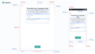
Exploration of spacings
Input field component in Figma
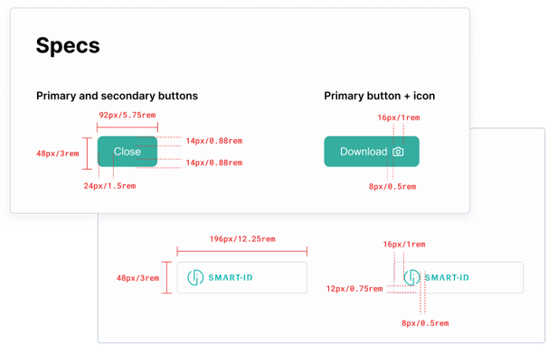
Example of specifications